

Pedagogical university
Brand Identity
The main goal is to expand the current brand identity for the admissions campaign.
Key tasks:
1. Creating new design elements: patterns and icons
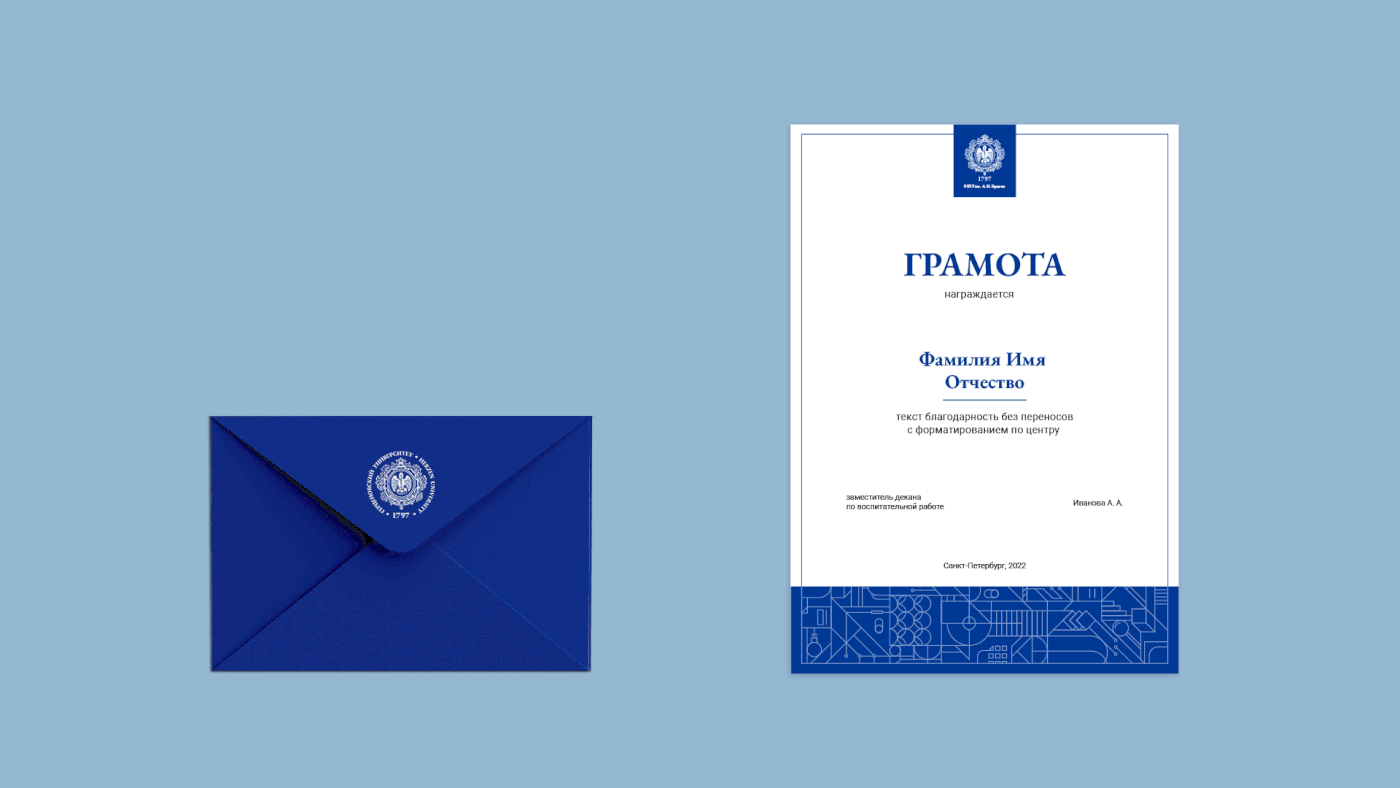
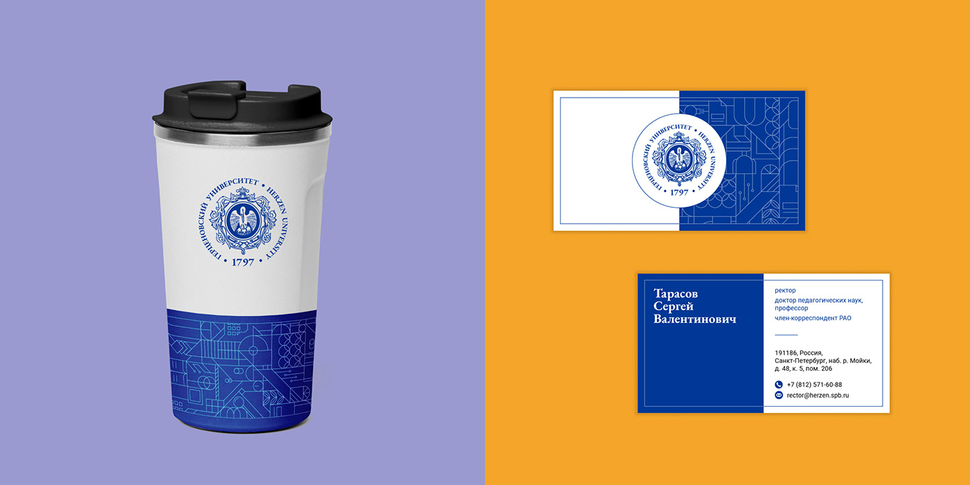
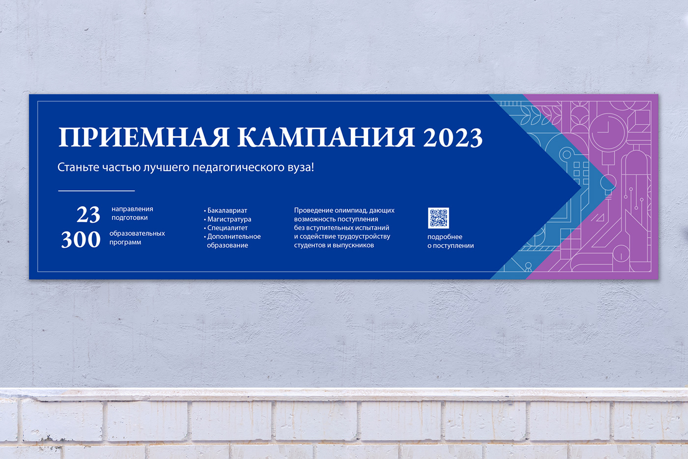
2. Design of souvenir and printed product layouts
3. Providing clear and consistent brand guidelines
1. Creating new design elements: patterns and icons
2. Design of souvenir and printed product layouts
3. Providing clear and consistent brand guidelines

Part 1. Сonstants
— The pelican is a symbol of pedagogy and compassion
— EB Garamond is antique typeface that emphasizes the university's long history
— EB Garamond is antique typeface that emphasizes the university's long history
— The blue color is chosen for its significance in heraldry
Part 2. Architectural pattern

The pattern featuring architecture was designed for official and premium carriers. It consists of images of the university's 5 most recognizable buildings and the embankment of the Moika River, where the university is located


Part 3. Geometric pattern
The geometric pattern is more widely used. It is abstract, but it also contains images of some elements associated with learning: magnifying glass, light bulb, chip, documents, book, etc.


Part 4. Icons
A set of 24 icons is made for university study directions. An icon combined with a geometric pattern and a certain color forms a recognizable style of each direction.


Thank you for watching!


